Author Archives: rjosyula

Release Notes v4.1843

The latest release includes bug fixes and minor improvements to existing features to improve the overall stability.

In this release, the following issues were identified and fixed.

  • Certain Users were unable to access the user preferences screen
  • Change of plan now refreshing data in Tgrid properly
  • Added option to Zip files in FTP directory
  • Double Click for Editing in preview mode now working
  • Subtotals now accurately calculated for time fields
  • Default bookmark filter now loads by default for all workbenches
  • For export to csv header row no longer has  extra comma
  • Sort for IDO list retained after clicking back button
  • Server side graphing refreshes automatically when changing group by option
  • Improved logic in network visualization when changing direction
  • Grid Import now supports new line character
  • Issue with zero displayed as null now fixed
  • Pivot data filter enhanced logic to retain previous filters when fields were not in bookmark list
  • Mass Edit now displays empty option for dropdowns
  • Changed conditional formatting to not apply to full row

Release Notes v4.1827

The latest release includes some significant changes to the UI. These changes include some new functions along with  cosmetic changes made to existing UI features. The latest patch also includes bug fixes and other improvements made to existing features to improve overall performance and stability.

The new features are

  • Add new record in Inline Edit Mode
  • New screen to check existing subscriptions

UI Improvements

  • UI Toggling between modes changed to single click
  • Changes to Outline Edit for Grids
  • Compact Top Menu bar
  • Icon to display new release notes post ->       Whats new v41825

New Icons to switch modes

Preview/Drilldown Mode

  • A new preview icon is now used to switch between default/preview modes
  • When selected, the icon has an orange border to represent it is in preview mode.
  • When unselected it is in default mode(Click on cell to see drilldown/goto options)

Preview Toggle v41824

Edit Mode

  • A new pencil icon is now used to represent the edit mode.
  • When selected the icon has an orange border to represent it is in Inline Edit mode.
  • When unselected it is in default mode(Outline edit – Click on cell to see edit/copy/delete options)

Edit Toggle v41824

Add new record – Inline Edit Mode

Previously, adding new records was only supported through outline edit mode. With this release, new records can also be added in Inline Edit Mode

  • Switch to Inline Edit Mode and click on Actions -> Add new record
  • A new row is added to the top of the grid to enter values and save.

Inline Add new record v41825.gif

 Outline Editor – Improvements

The outline edit mode for grids has been redesigned for better usability and ease of data entry. The following changes have been made

  • Errors while saving show up as a red icon next to the field which has the error

Error v41825

  • Required & Revert and read only flag appears on the right side of the field.

Right flags v41825.png

  • The required field smartly disappears once data is entered and reappears if it is blank again

Required v41825.gif

  • Any selections in groups/categories are saved for the browser used until cache is cleared.

Single line Top Menu

If the top menu bar has too many categories that cannot be displayed in a single line, a new “More” category is displayed with all other categories grouped under it as seen below in the picture.

Menu more v41824.png

New Subscriptions Screen

  • Go to User Settings -> User Preferences and click on the Subscriptions tab to view all subscriptions that the user has subscribed to for job alerts
  • Subscriptions can be deleted from this screen through the delete button

Subscriptions v41825.png


Release Notes v4.1822

This release includes two new improvement to existing features along with minor bug fixes to issues. There are other smaller improvements made to the system to improve performance and stability of the product.

Improvements to existing features

  • Grid workbenches support image data type in columns.
  • Preview mode now available for vertical grids

Images in Grid Workbench

The image column in a grid workbench can be identified by the icon present in each row.ImageId v41819

  • If there is an existing image, the image icon is displayed as seen above
  • If there is no image for the row, the upload icon is displayed
  • Click on the upload icon to upload any image

Imageupload v41823

  • To view the image click on the image icon to see a preview as seen in the above video
  • To reset or clear image, click on the image icon to see a preview and then click on the image again to open the image

Resetimage v41823

  • The maximum size limit for the image is currently 100kb
  • To preview all uploaded images click on the image icon on the column header

Imagepreview v41823.gif


Preview mode in Vertical Grid

Vertical grids now support preview mode.

Click on the default button and switch to preview mode and click on any data to see the relevant previews available(if any).

Vertical grid preview v41823.gif


Release Notes v4.1811

This release includes some new features along with bug fixes and improvements made to existing features to improve performance. We also introduce a new feature  in beta mode that will be released in the next release cycle.

The new features are

  • Subscribtions for job alerts
  • Queue Jobs

Improvements to existing features

  • Drilldown to details in schedule log
  • Ability to set landing workbench to default home page

New beta feature

  • Dashboards

Subscribe for Scheduled Job alerts

Users can now subscribe to job status alerts for scheduled jobs. They can choose which status change of the scheduled job they want to be alerted on. To subscribe, users can follow the steps below

  • Cloud Configurations -> Schedules
  • For the desired scheduled job, click on the three dots and click on subscribe
  • Select the status changes for which user wants to subscribe and close the window

Schedule Subscriptions v41811.gif

The user would then get an email for the subscribed status change as shown below. The user can click on the link to view the log

Subscription Email v41811

Queue Jobs

This release updates the scheduled jobs to have the ability to queue jobs when there are multiple jobs. This ensures that one job(if having a problem) would not prevent other jobs from running.

Schedule Log details

When viewing the log from the scheduled job page, a new button as been added to view the detailed log

Schedule log details v41811.gif

Landing Workbench update

A couple of  updates have been made to the new feature introduced last week where users can select a default landing workbench when they login.

  • Users can now select the landing workbench to be “landing page” if they have no preferred landing workbench. This will take them to the home page when they login
  • The landing workbench are now sorted and categorized based on the category

Default Landing Page v41811

Dashboards

In this release, a new feature called Dashboards(beta version) has been released. Dashboards provide a quick view of Key Performance Indicators (KPIs). A more detailed description of dashboards can be read here in the Dashboard Blog.

Dashboards

Dashboards offer key insights into KPIs (Key Performance Indicators) of various Supply Chain facets. Currently, there are 11 standard dashboards available on InSync Cloud

  1. Management Overview
  2. Fulfillment Overview
  3. Inventory Overview
  4. Production Overview
  5. Capacity Overview
  6. Sourcing Overview
  7. Distribution Overview
  8. Messages Overview
  9. Root Cause Overview
  10. Alerts
  11. Status Overview
  12. Plan Regression KPIS

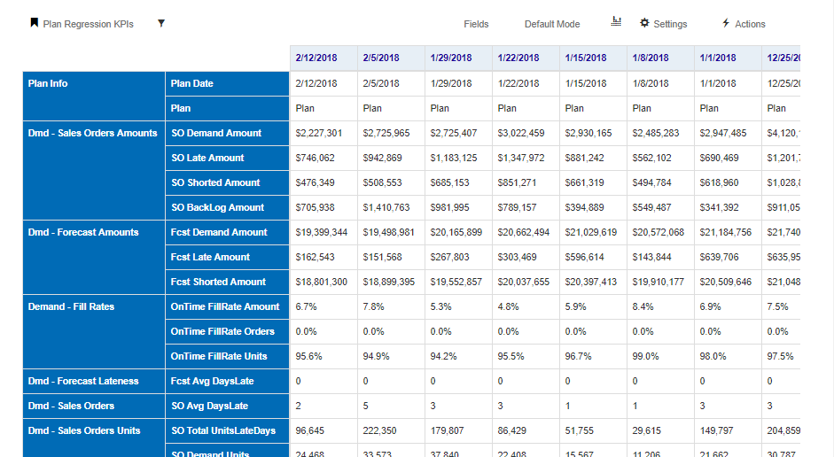
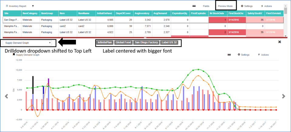
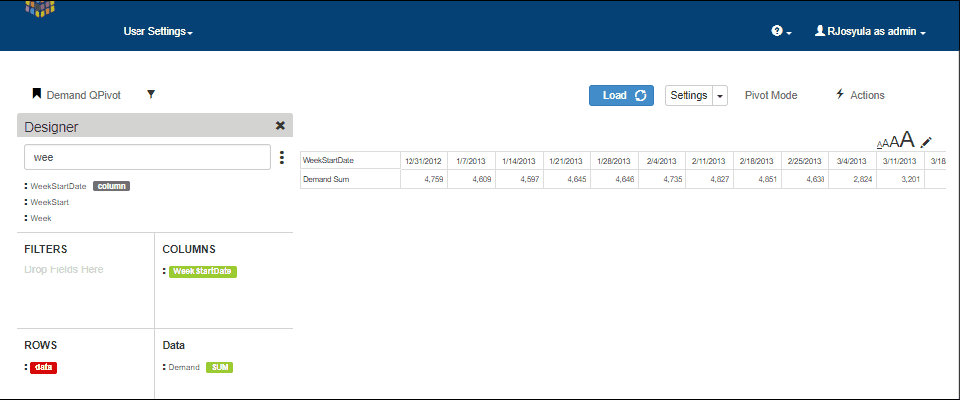
The data in  dashboards are visualised through a combination of grids,charts, pie charts, heat charts etc. A sample dashboard is shown below

Dashboard v41811.png

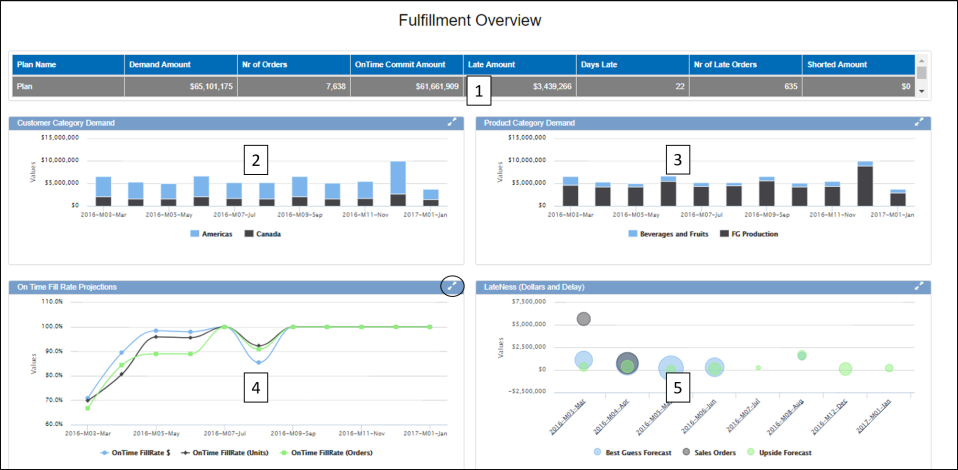
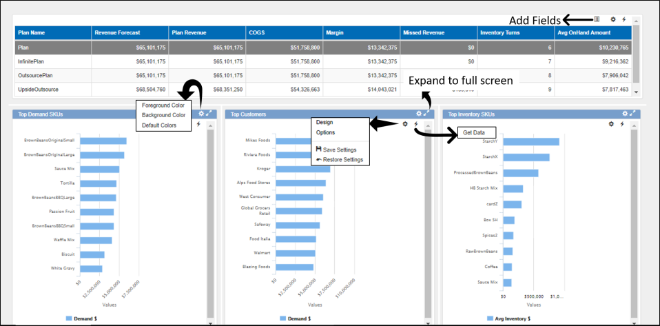
In the above example of a Fulfillment Dashboard, there are two components. 2,3,4 & 5 are different types of charts that show data based on the selection in component 1.

Clicking on the double arrow button expands any component to full screen

Dashboard Navigation

It is common for most dashboards to have a grid at the top with a high level data summary that drives the other components to show the relevant data.

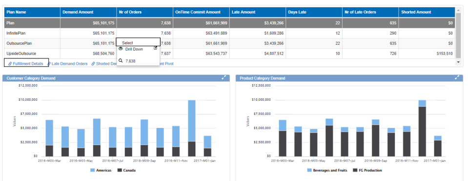
Clicking on any row and selecting the row will refresh the data components below to show the relevant information

For some grids, there are also links to other workbench that are relevant to this data. In the below example, from the fulfillment dashboard there are links to open Fulfillment details, late orders and shorted orders. These links can be found just below the grid with the link icon.

Dashboard Selection v41811.png

Dashboard Settings

The dashboard settings are accessed through the wheel icon at the top right corner which is only visible on mouse hover.

Dashboard settings v41811

Click on the wheel icon to navigate to different controls of the dashboard

  • Get Data – Refreshes the data in the dashboard
  • Show Configurations – Brings up the configuration options for all the components of the dashboard

Dashboard show configurations v41811.gif

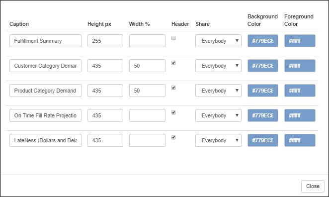
  • Edit – This allows to control the caption, height, width , color settings and security of the dashboard components

Dashboard Edit v41811.png

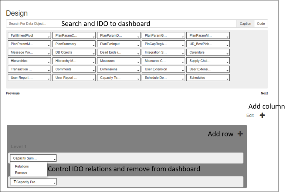
  • Design – In design, the layout of the dashboard can be configured as well as add more components to the dashboard(Admin users only)
    • Search and add IDO to dashboard through the search box at the top
    • Click on the “+” button to add column dashboard and within the dashboard click on the “+” button to add more rows(seen in picture below)
    • Click on the Edit button to set default height and delete components
    • Click on existing IDO within dashboard to add relations or remove it from dashboardDashboard Edit page v41811
  • Save Layout – Saves any layout changes made to dashboard
  • Save settings – Saves any setting changes made to dashboard
  • Clear layout – Clears any recent changes made to dashboard to revert to original layout

Show Configurations

After clicking on the show configurations, the configuration options for each component within the dashboard are visible. The following can be controlled through these

  • Color settings
  • Adding fields
  • Settings/Options for grid/charts
  • Refresh data
  • Export for grids
  • Expand component to full screen

Dashboard all configurations v41811.png


Release Notes v4.1808

This release includes two new features along with bug fixes and improvements made to improve performance and usability.

The new features are

  • Landing Workbench
  • Add columns from a csv file to TableMaster

Landing Workbench

Users can now define a landing workbench in user preferences. This will become the default page the user opens to after login. To set this

  • Navigate to User Settings -> User Preferences
  • Select the landing workbench from the dropdown

Landing Workbench v41808.gif

Add columns from csv file to TableMaster

When creating a new table in Tablemaster, users have the option to add the column names from a csv file. To do this please follow the below steps

  • Configurations -> TableMaster
  • Press the action button -> Add Table
  • Enter a table name and click on the tick mark
  • Now click on add columns from csv file to select the csv file from local disk
  • Select the file and click on the check button which will populate the columns from the csv file into the column names

csv add columns v41808.gif


Release Notes v4.1802

This release includes minor UI changes and bug fixes to improve overall performance and usability. The changes are

  • New Preview Drilldown layout
  • New layout for Cloud Configuration
  • Processing information displayed in IDM Sequence update screen

New Preview Drilldown Layout

In all controls where the user opens a drilldown in preview mode, the following changes have been made

  • Dropdown for selecting different drilldowns is at top left (it was in the center previously)
  • Drilldown labels are at the center with bigger font

Picture1.png

Cloud Configuration landing page

The cloud configuration landing page has been modified to take user directly to the Schedules page with the company information displayed at the top.

Picture2

Click on the 3 lines beside the company name to view other cloud configuration screens. These screens are only available to admin users

IDM Sequence update processing screen

When a user updates the sequence for IDMs through change order, the screen displays the processing information. Until all the process are done, the sequence update is not complete.

GIF1Picture3

Release Notes v4.1740

bullets.png

This release includes a host of new features as well as general improvements and bug fixes to improve the performance and make the experience seamless and stable. The list of new features added are given below with hyper links to their individual posts that explain the feature in detail.

New UI Features


qPivot

A new component called the qPivot is now available in the latest release. qPivot offers a lot of flexibility to the user in data visualisation. The main features are

  • Summarize Data in pivot and graph mode
  • Data Filters
  • Edit mode in graphs and pivot

The picture below is a screenshot of qPivot displaying the various elements in it.

qPivot

  • The qPivot has the Designer to the left with data displayed on the right side.
  • The load button loads/refreshes data after the fields are selected
  • Toggle between Pivot/Graph mode
  • Change the size of the pivot through the size control option

1) Designer – qPivot

The designer section contains the following

  • All fields available for this pivot
  • Search – search for any existing field
  • Filter area – Filters applied on any field are displayed here
  • Rows – fields which are to be in the row section of pivot
  • Columns  – fields which are to be displayed in the column section of pivot
  • Data  – fields which are to be displayed as data in the pivot

There are two ways of moving the field to the corresponding pivot section

  • Click on the three dots beside the field and select from the available row/column/filter/data option
  • Drag the field to the corresponding section

Designer add field

Designer (1)

  • In any section the order of the fields can be changed by draging and dropping them at the required position.
  • Dragging a field to the filter area brings up the filter pop up where users can apply the filter
  • Data fields have further option to select how the data is summarized. ex: count, sum etc.  Multiple summary options can be selected and viewed in the same pivot.

qpivot demand

Graph Mode

To illustrate how the graph mode works in qPivot, we use the following example

Row fields: Site, Item

Data : Demand, Budget, BestPickFcst

Column: Quarter(Filtered to show only 2016 Quarters

  1. In the graph mode, the data is initially shown aggregated i.e Aggregated to all the sites for each data measure selected
  2. Users can select/deselect the sites as well as series measures to see them in the graph. The data are updated immediately upon selection
  3. The graph can be viewed in stack or compare mode.
  4. Clicking on any bar opens a Pie chart displaying the data at Item level.
  5. Data can be further drill down-ed to display the graph at item level for the selected quarter
  6. Users can also select Item from the row section and directly view the graph at item level
  7. The video below shows a small sample of using the graph mode in qPivot

qPivot Graph Mode.gif

Pivot Mode

The same example is used for illustrating the qPivot in pivot mode

  1. In the pivot mode, all the data is shown. i.e for all sites and data measures
  2. Click on any site to drilldown to the item level data
  3. If there is any other row field below item, then the user can further drilldown by clicking on any item to see the breakuP

qPivot Graph Mode

Editing in qPivot

Edit option is available in both pivot mode as well as graph mode in qPivot

Pivot Editing

  • Click on the pencil icon to activate the edit mode
  • The editable cells change to boxes in which values can be entered
  • Click on discard to undo the entered values
  • Click on save to save the values

QPivot Pivot-Edit.gif

Graph Editing

  • Click on the pencil icon to activate edit mode
  • For any bar, drag the bar to the desired value position in the graph
  • Click on save to save the changes
  • Click on discard to undo the changes before save

QPivot Graph Mode-Edit

QPivot Settings

Click on the settings button in pivot or graph mode to change the following settings.

For Pivot Mode: Change appearance of row totals, column totals, style, stripe and colors of the pivot

For Graph Mode: Add additional axis, switch between horizontal/vertical axies, edit captions and colors as well as change the type of graph between line, sp line and bar graphs

Plan Definition & Plan Calendars

Two significant improvements have been made to Plan Management

  • Access and edit plan definition
  • Add new plan calendars

Plan Definition

From the Plan Management screen, click on any plan definition to navigate to its page

In the Plan Definition screen, users can edit and make changes and save them

Plan Definition

Add Plan Calendars

From the plan definition screen, users can add plan calendars

  • Click on the action button in the plan definition screen
  • Select the Plan Start Date and bucket size
  • Enter the number of calendars to be defined and select the transaction measures
  • Click on add to create and add the plan calendars

Add Plan Calendars