A new component called the qPivot is now available in the latest release. qPivot offers a lot of flexibility to the user in data visualisation. The main features are
- Summarize Data in pivot and graph mode
- Data Filters
- Edit mode in graphs and pivot
The picture below is a screenshot of qPivot displaying the various elements in it.
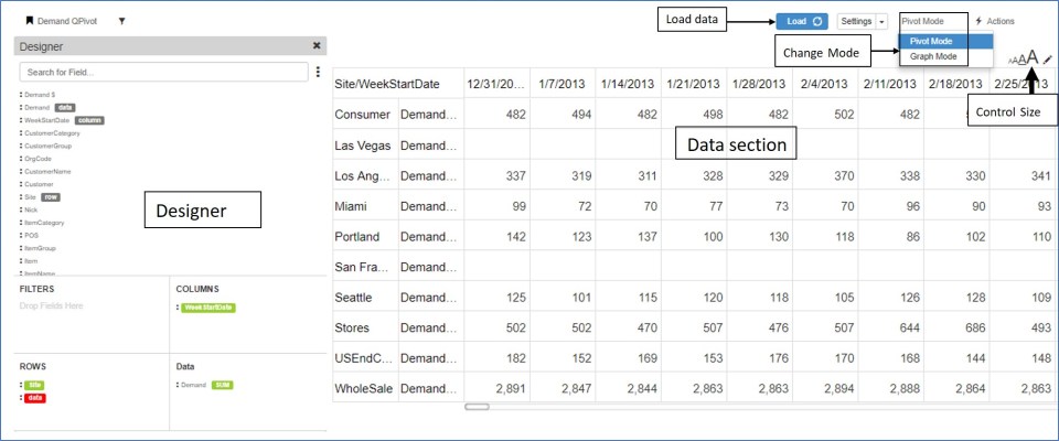
- The qPivot has the Designer to the left with data displayed on the right side.
- The load button loads/refreshes data after the fields are selected
- Toggle between Pivot/Graph mode
- Change the size of the pivot through the size control option
1) Designer – qPivot
The designer section contains the following
- All fields available for this pivot
- Search – search for any existing field
- Filter area – Filters applied on any field are displayed here
- Rows – fields which are to be in the row section of pivot
- Columns – fields which are to be displayed in the column section of pivot
- Data – fields which are to be displayed as data in the pivot
There are two ways of moving the field to the corresponding pivot section
- Click on the three dots beside the field and select from the available row/column/filter/data option
- Drag the field to the corresponding section

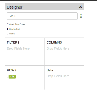
- In any section the order of the fields can be changed by draging and dropping them at the required position.
- Dragging a field to the filter area brings up the filter pop up where users can apply the filter
- Data fields have further option to select how the data is summarized. ex: count, sum etc. Multiple summary options can be selected and viewed in the same pivot.
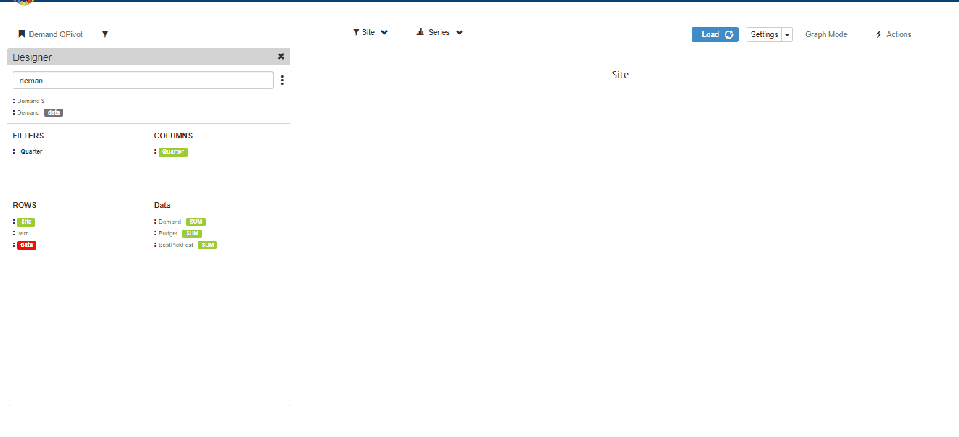
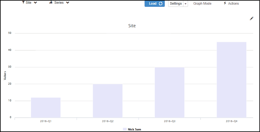
Graph Mode
To illustrate how the graph mode works in qPivot, we use the following example
Row fields: Site, Item
Data : Demand, Budget, BestPickFcst
Column: Quarter(Filtered to show only 2016 Quarters
- In the graph mode, the data is initially shown aggregated i.e Aggregated to all the sites for each data measure selected
- Users can select/deselect the sites as well as series measures to see them in the graph. The data are updated immediately upon selection
- The graph can be viewed in stack or compare mode.
- Clicking on any bar opens a Pie chart displaying the data at Item level.
- Data can be further drill down-ed to display the graph at item level for the selected quarter
- Users can also select Item from the row section and directly view the graph at item level
- The video below shows a small sample of using the graph mode in qPivot
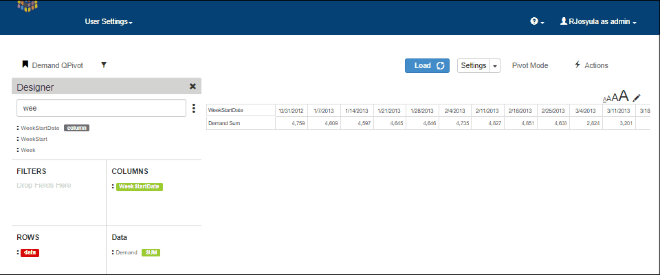
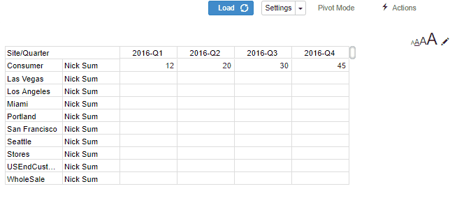
Pivot Mode
The same example is used for illustrating the qPivot in pivot mode
- In the pivot mode, all the data is shown. i.e for all sites and data measures
- Click on any site to drilldown to the item level data
- If there is any other row field below item, then the user can further drilldown by clicking on any item to see the breakuP
Editing in qPivot
Edit option is available in both pivot mode as well as graph mode in qPivot
Pivot Editing
- Click on the pencil icon to activate the edit mode
- The editable cells change to boxes in which values can be entered
- Click on discard to undo the entered values
- Click on save to save the values
Graph Editing
- Click on the pencil icon to activate edit mode
- For any bar, drag the bar to the desired value position in the graph
- Click on save to save the changes
- Click on discard to undo the changes before save
QPivot Settings
Click on the settings button in pivot or graph mode to change the following settings.
For Pivot Mode: Change appearance of row totals, column totals, style, stripe and colors of the pivot
For Graph Mode: Add additional axis, switch between horizontal/vertical axies, edit captions and colors as well as change the type of graph between line, sp line and bar graphs
